
Project Date
2017 - 2018
Team
Self
Role
UX Designer & Researcher
INTRODUCTION
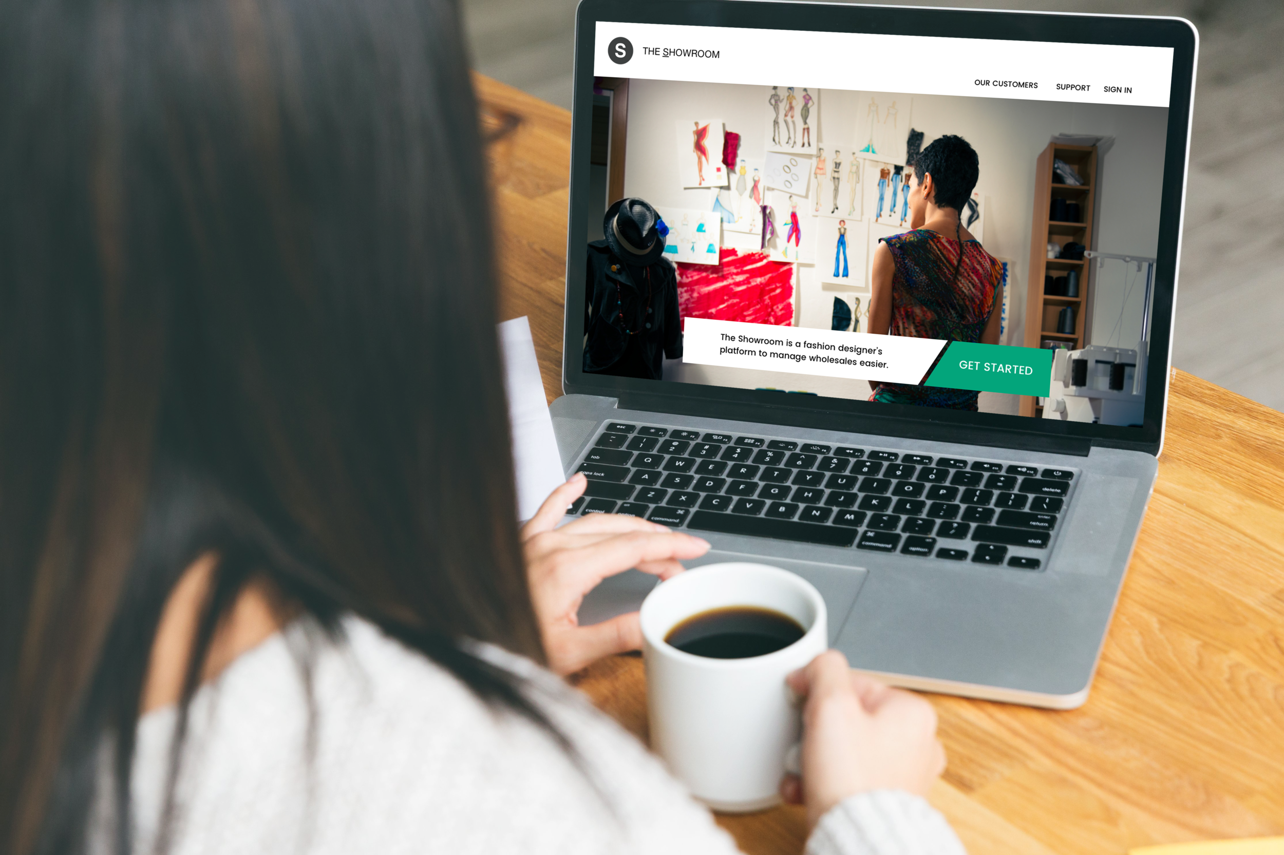
The Showroom is a simple and user-friendly site that helps fashion designers conduct core tasks to run their business. It manages collection inventory, captures client information, collect sales orders and tracks completed team tasks.
Independent fashion designers usually manage their inventory, clients, team, and orders through a spread of software tools to stay organized, design and sell their products. Designers don’t initially employ complex enterprise software starting out because the cost of commitment is high, the available features are complex, and their manufacturing output is lower.
In this project, I designed the deliverables and the visuals of the application for my final capstone project while enrolled in the UX Design program for Springboard.
Antiquated processes in a fast paced industry
Current tools don’t keep up with designers
There’s no single tool for independent and start-up fashion designers to digitally manage their collection and business all in one place. This forces designers to use tools that don’t work efficiently for their business. Designers use physical sales tickets to intake orders and need to input them into their spreadsheets before making production requests.
To solve this, I wanted to build a digital solution to help users manage all business needs for fashion designers, including ways to manage wholesale transactions between department stores and boutiques without relying on a pen-to-paper process.
Research
I conducted a simple survey and semi-structured interviews with fashion designers that have established their clothing brands for at least a few years. I also did a competitive analysis of the existing companies that offer one-stop services for independent fashion designers to understand the reality of challenges that exist for them.
Goals
Determine the demographics of fashion designers as users.
Uncover the benefits of helping users with digital tools to assist with their most timely processes, with the goal to streamline their communication and sales tasks.
Identify a market of competitors, understand how they work, what their features are, and where the threats and opportunities are.
Recognize the pain-points with current application usage and sales processes.
Simple tools withstand the test of time
trying to balance Business uncertainty
Learnings
Users use Microsoft Excel to calculate basic costs for production and sales.
Users collect sales orders via pen-to-paper, engage in transactions with vendors via email, and often pay retainers to showrooms to outsource their marketing and sales.
Designers don’t reach for third-party management software due to smaller production runs and sales volume to justify the needs for complex features.
Pain Points
From my research, I realized that my interviewees:
Intensely multitask between marketing, designing, and sales under strict seasonal deadlines.
Are challenged by not receiving on-time payments from stores and custom requests from vendors as a condition for entering into a sale agreement.
Have to invest more time selling their own products to save costs from using showroom brokers.

Competitors focus on bigger brand operations
Too little time for too much complexity
Companies offering services for designers have a common system to help users make and place orders, but their features differentiate between direct design tools, marketing and e-commerce.
Out of the ones researched, AIMS 360 offers the best range of features with partnered network and communication during the manufacturing process, but have limits with a two-user minimum, no allowance for use on other devices, and no portals for customer and client management.
Threats: Comprehensive features, network of support, 3rd party integrations.
Opportunities: Cost for entry, unverified user ratings, simplified feature options, community building.
I created 3 personas that capture the paradigm of the user group.
My personas are solo entrepreneurs that constantly problem-solve business challenges in ways that requires deep networking and outsourcing of timely activities. This led me to understand the importance of being and staying organized within their workspace. They also face intense competition for deadlines, time and relevance.
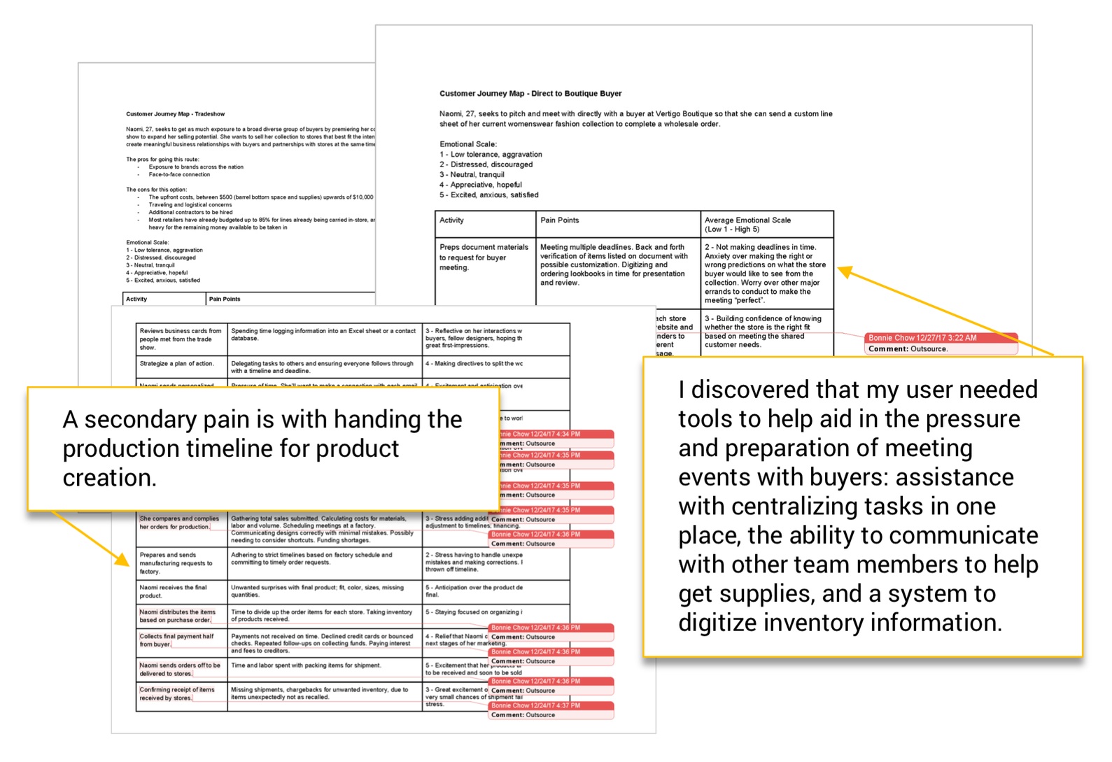
Fashion designers typically either sell directly to store buyers or attend trade shows to present and sell their product lines. I mapped both journeys to dig into this section of their day-to-day during this special sales process. There were many low points that could be solved if designers could chose to outsource the task. Any remaining tasks not easily solvable beyond that become a closer focus.
The biggest pain point: the preparation of digital sales materials to be able to share with buyers (line sheets and look-books, which are essential to presenting products to buyers in a professional manner).
Originally I saw that this product was going to be just a wholesales payment manager to communicate and exchange goods for payment. With the research and insights gathered so far, I understood that my users have other prioritizing challenges leading up to the success of completing a successful sale.
Design Statement
Using my research and synthesis as my guide, I summarized my findings with this problem statement:
“Busy independent financial designers need a way to efficiently plan and organize their business tasks in order to achieve sales success.”
My design requirements to address the problem statement:
help users find collection inventory and share a lo-fi catalogue quickly
help users create and track orders
help users log existing and new buyer relationships
help users keep track of multiple tasks completed and upcoming to meet deadlines
Iterations
My site design began with categories based on my user stories: inventory, clients, orders and support. My initial attempt to design the site navigation began with a first and second level hierarchy.
I realized that my design flow did not quite answer the top priorities within my user stories, which needed further depth in order to help the user accomplish specific tasks.
I conducted a card sort to validate relevant vocabulary and terms so that it made sense for users.
Sketches for inventory page user flow.
I determined that a user’s successful sales experience begins with inventory management. This MVP feature would be the foundation for building upon other secondary and tertiary ones.
My initial sketches show how a user wants to add categories to his/her inventory in order to organize and quickly search for items. For example, he/she could chose to filter the collection based on what has appeared in editorial campaigns.
User flow for adding a additional category to the user’s inventory.
I simplified my initial user flows while creating my sketches. This step helps the user get to the completion of the desired task faster and more efficiently, and with less confusion.
Information architecture updated.
I expanded the site map to include more possible features for the user. This included more inventory customizations that would help the user chose what to show buyers based on their preferences and sales demands.
I became curious to understand how various tasks should be categorized and prioritized based on the user stories. I conducted a card sort that helped to inform the shape of my information architecture by simplifying the top-level navigation categories down from seven to four.
L to R: Revisions to the same user flow, further simplifying the user’s interaction on the site.
Initially, I continued to stretch my user flows (left) to show that the user can get to the same destination in multiple ways. I believed that the detailed expansion helped illustrate what actions were possible for the user. This version ended up being more complex with unnecessary decisions and steps for the user to get to their end goal.
After reviewing and revising the user flow (right), I understood that simplifying the steps gave the user a direct path, but also allowed for future opportunities to add more related features on future needs.
Revisions to the information architecture. (From less smushed to standing taller!)
I reformatted the visual presentation of the initial site map by removing the repetitive routes and pages that led to the same destinations, and reorganized the flow to move vertically instead of horizontally for future potential growth.
DESIGN
Part 1 of 3. Inventory user flow feature.
Part 2 of 3. Inventory user flow feature.
Part 3 of 3. Inventory feature, main page.
Feature: Inventory Search
share collection quickly with a custom catalogue
Designers would be able to quickly make line sheets (catalogue) to help share with their clients by selecting on various items in their collection. They can archive items, enlarge photo grid settings for better visibility and print materials quickly with a PDF option that can be shared and discussed in sales meetings.
Part 1 of 2. Team member user flow feature.
Feature: Add a Team Member
Delegate responsibilities to get more done
Designers do often employ help to delegate tasks for projects, sales and marketing. I created a feature that would allow designers to create and track responsibilities to each team member digitally.
Page 2 of 3. Team member usability test.

Page 3 of 3. Team member feature, with an updated task section from usability testing results.
Fixed task list vs. a pop-out task list
a more visible list enables delegation
I wanted designers to be able to accomplish their tasks more efficiently by delegating responsibilities digitally. I was curious to see if it would be more convenient to keep the task list fixed in one area, or to have it readily available no matter where the user is engaging on the site (with a “pop-out” tab). I conducted a usability test to seek answers.
My original assumption was that users would ultimately like to have access to their tasks at all times in the event that one suddenly recalls something to do and needs to immediately jot it down for later.
Based on un-moderated usability test results, users spent slightly more time accessing the “pop-out” option to complete a task, but had less difficulty finding a way to expand on the task section to delegate tasks.
Isolating the tasks needed to a specific area of the site may be more helpful in creating less distractions when interacting elsewhere on the site. Having the task list option more “readily available” in a fixed area in the team section involves less clicks to achieve the desired page.
Part 1 of 5. Hi-fi wireframes and user flow of the orders feature.
Part 2 of 5. Hi-fi wireframes and user flow of the orders feature.
Part 3 of 5. Hi-fi wireframes and user flow of the orders feature.
Part 4 of 5. Feature: Adding a new client profile.
Part 5 of 5. Feature: Discount on orders.
Feature: Order Discounts
saving money helps save users’ time
I created a place for designers to create a sales order after building a profile for a new store or buyer into their database. As an incentive for their clients to place their orders quickly (thereby saving time!), I created a discount tool to help do the math for the user.
A simply designed prototype
ready for growth and more user features
After rounds of review and critiques on the best features and wireframes, I created the hi-fidelity mockups and moved on to the final design and created an interactive prototype. I kept the visual design minimal and simple to keep the user from incurring additional distraction from the various complex tasks that are involved in the production and sales processes.
Takeaways & Refinement
Conclusion
my Goals changed with the users’ needs
Designers are not prioritizing operational efficiency by using better digital tools. This is either from the lack of knowledge of the best available tools, or from the high cost of these existing resources. Few companies offer to serve independent designers on a such a smaller scale.
My hypothesis changed given consideration to the feedback of user’s pain points, way before the user got to the point of collecting a sales order. Users have to meet demands within production, marketing, and building client relationships and often can’t do it without help from a team. It was important to address these matters as a new hypothesis over the need to just fix ways for users to collect sales other than with pen-to-paper.
The open question during the research was: was a task list needed at all? Users have a lot of stuff to do and need a team to do it. This led me to focus more on the ability to assist the designer to delegate tasks to others for efficiency.
As a result, I ended up with a customer relationship manager system with user options and tools to handle business needs, including a way for them to manage their inventory, track client relationships, and create sales orders. It’s a cost effective solution, and can be done with a low development time. It has massive room for growth and new features.
Let’s design together. :)